Fang Siying Packaging Quotation System A/B Testing
Ownership Chao-LIng Chyou(UX Designer)
Pattern Client Project
Categories UX Research
Contribution A/B testing, User Interview
Background problems
Fang Siying is plastic packaging company based in Taiwan. Due to diversity of materials cross different plastic, printing and customised packaging patterns, solving the problems that sales need to take more time supplying with personalised quatation, they started to organise quotation system to help sale staffs to reduce the time of filled in quotation manually.
This quatation system had built up for almost one year, but it had been lack of further improvement depends on changing new operation staff.
This quatation system had built up for almost one year, but it had been lack of further improvement depends on changing new operation staff.
What is purpose of A/B testing?
To evaluate usability for current version and previous interfaces whether its aligned with user’s usability and accessibility and further improvement, digging out the insights from user’s reactions.
What is metric of A/B Testing?
- Clarify whether interfaces aligned with sales’s need
- Observe the sale’s behaviours with their painpoints
- Figure out the possibilities of improvements
How to conduct A/B testing activities? - Testing the flow of ‘add new quotation system’
Focus group: 4 people sales staff
Tasks: They need to add per new quotate evaluation, from add materials, product requirements, and numbers of products, delivery fees and packaging fees.
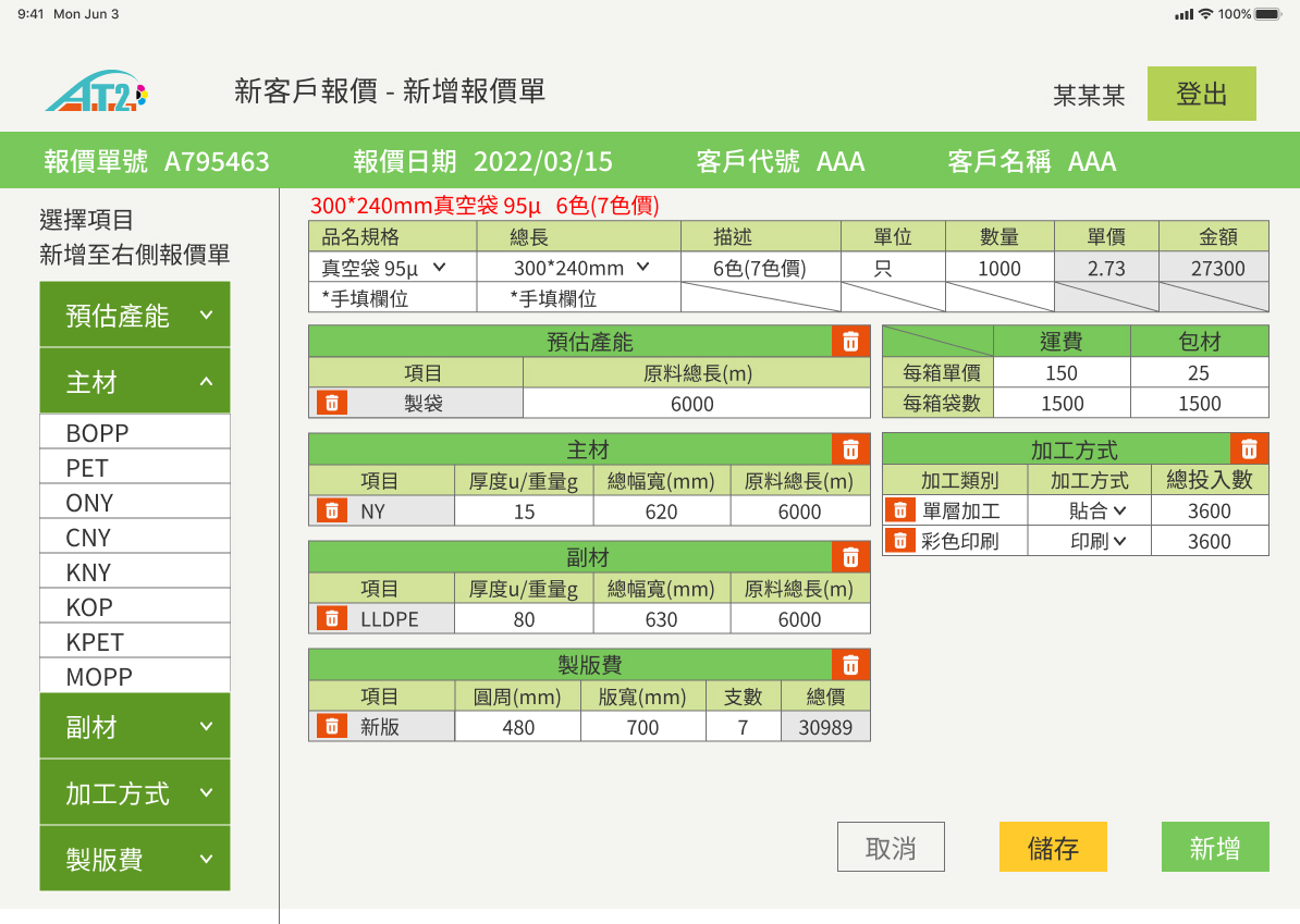
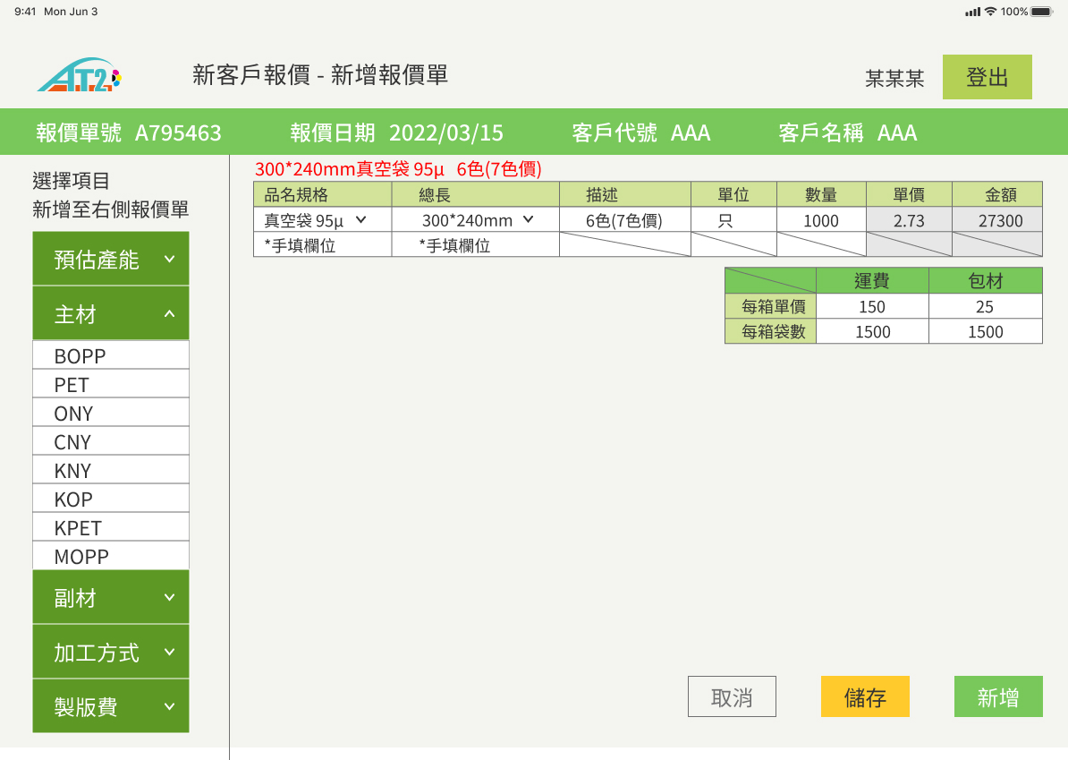
A/B testing interfaces
A interfaces(Existing interface)
B interfaces(Original interface)
Insights from A/B testing
- People who aged over 40, which is occupied over 75% of sale staffs are likely use mobile phone and iPad due to lack of portable computer for several clients in one day
- They don’t know what is the different main materials and secondary materials
- They need more bigger fonts due to their eyesight can’t quick recognise information
- They are struggling and confused deleting those categories of things due to lack of materials and printing knowledge
Insights from eye-tracking

- 75% of user click blue dots area for back to previous page(blue dots)
- Only 25% of user click cancel button on the bottom(red dots)
- 100% of users feels struggling to click categories of main materials and secondary materials because it spend almost 30s to add into the list (brown dots)
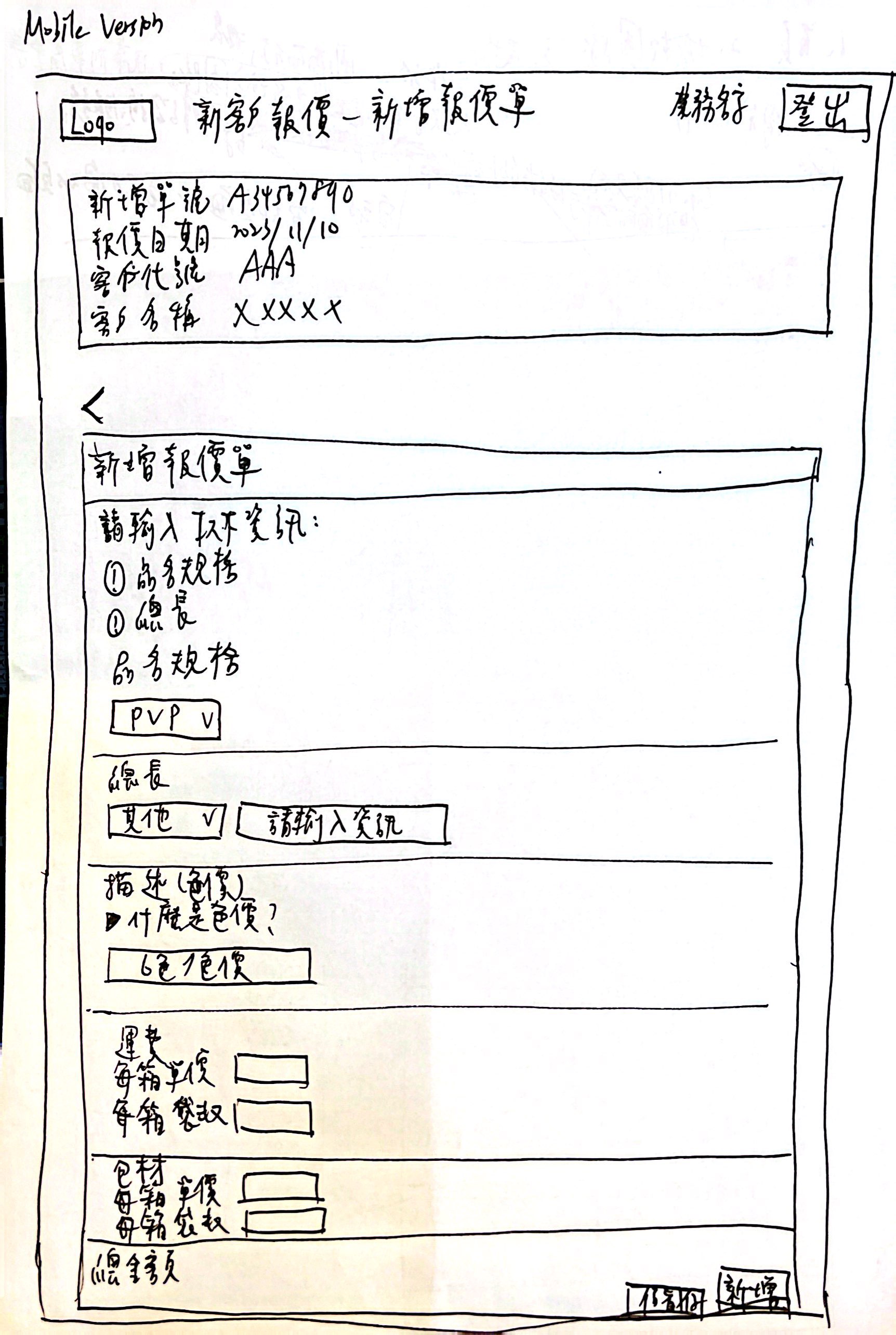
Recommendations with new version of Wireframe
Based on previous A/B testing and eye tracking, categorising out the insights, I created new wireframe for the tageted users, based on previous observation.
- Add mobile version as main direction development aligned with RWD version
- Remove cancel button, add arrow as substitute as “back”
- Used bigger font as topic to let sales can quick recognise the problems
- Split off information into single categories to show bigger font and lists to scroll down the information clearly
- Sales can add requirements, lengths, and colour prices, delivery fee and packaging fee as clients can quickly know estimated price
- Remove the original ‘main materials’ and ‘secondary materials’ as non-necessary information for sales and clients